Often developers need to embed a dialog box to pop additional content into a webpage. This feature is provided by Bootstrap 4 through a modal. In this tutorial, you will learn about Modal and the various ways of its implementation.
What Is a Modal Window?
In the context of a web page, a modal window is a rectangular or square box that opens up inside the current web page, above the position of everything else, to present some information separately on the web page. It can be used for various purposes, such as displaying a lightbox, user notifications, or fully custom-designed content.
Example:
How to Create Modal Using Bootstrap?
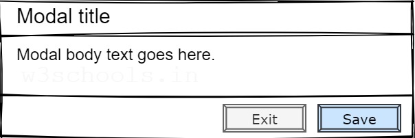
The following HTML code snippet shows the bootstrap model implementation by specifying various CSS classes on HTML elements. In this example, the modal header, modal body, and modal footer are included within the modal content. Furthermore, all these elements are included in the model dialog and the primary parent model.
Example:
<!-- Button to trigger Demo modal -->
<button type="button" class="btn btn-primary" data-toggle="modal" data-target="#demoModal">Launch Demo Modal</button>
<!-- Demo modal -->
<div class="modal" tabindex="-1" id="demoModel">
    <div class="modal-dialog">
        <div class="modal-content">

            <!-- Modal header -->
            <div class="modal-header">
                <h5 class="modal-title">Modal title</h5>
                <button type="button" class="close" data-dismiss="modal" aria-label="Close">
                    <span aria-hidden="true">×</span>
                </button>
            </div>

            <!-- Modal body: The main content goes here -->
            <div class="modal-body">
                <p>Modal body text goes here.</p>
            </div>

            <!-- Modal footer -->
            <div class="modal-footer">
                <button type="button" class="btn btn-secondary" data-dismiss="modal">Exit</button>
                <button type="button" class="btn btn-primary">Save</button>
            </div>
        </div>
    </div>
</div>
Bootstrap Modal Features
The example above demonstrates a basic model, and many more features can be used with the bootstrap model to customize it according to design and development needs.
Static Backdrop
When the backdrop option is set to static, the modal will not close when clicked outside the modal.
Example:
<div class="modal" id="demoModel" data-backdrop="static" tabindex="-1" aria-hidden="true">
...
</div>
Scrolling Long Content
When there is a large amount of content within the modal body, and the modal becomes too long for the user's viewport or device, the modal will automatically trigger its scrollable feature within the modal content area.
Example:
<!-- Scrollable modal -->
<div class="modal-dialog modal-dialog-scrollable">
...
</div>
Vertically Centered Modal
This feature sets the modal box to the horizontal and vertical alignment center of the page.
Example:
<!-- Vertically centered modal -->
<div class="modal-dialog modal-dialog-centered">
...
</div>
Animation
This feature enables fading effects during the opening or closing modal.
Example:
<div class="modal fade" id="demoModel" tabindex="-1" aria-hidden="true">
...
</div>
Customize Modal Size
The model size can be customized according to the requirements. Such as small, large, and extra-large size models.
Example:
<div class="modal-dialog modal-xl">...</div>
<div class="modal-dialog modal-lg">...</div>
<div class="modal-dialog modal-sm">...</div>
In addition to the above features, other bootstrap features can also be used in the model, such as tooltips and popovers, grid systems, embedding YouTube videos, and more.